Apr 14, 2025
It’s Just a Logo. Until It’s Not
This section explains that logos are not the creators of brand equity — but the holders of it. Like flags, they gain meaning from what surrounds them.
Design & Identity
subtle-branding
logo-design-principles
A Few That Got It Right (and a Few That Didn’t)
Let’s be clear — this isn’t about shaming logos.
It’s about understanding what makes a mark memorable… and what makes it miss.Because a logo isn’t just about looking “cool.”®
Here are a few that nailed it — and a couple that remind us why clarity, timing, and restraint matter.
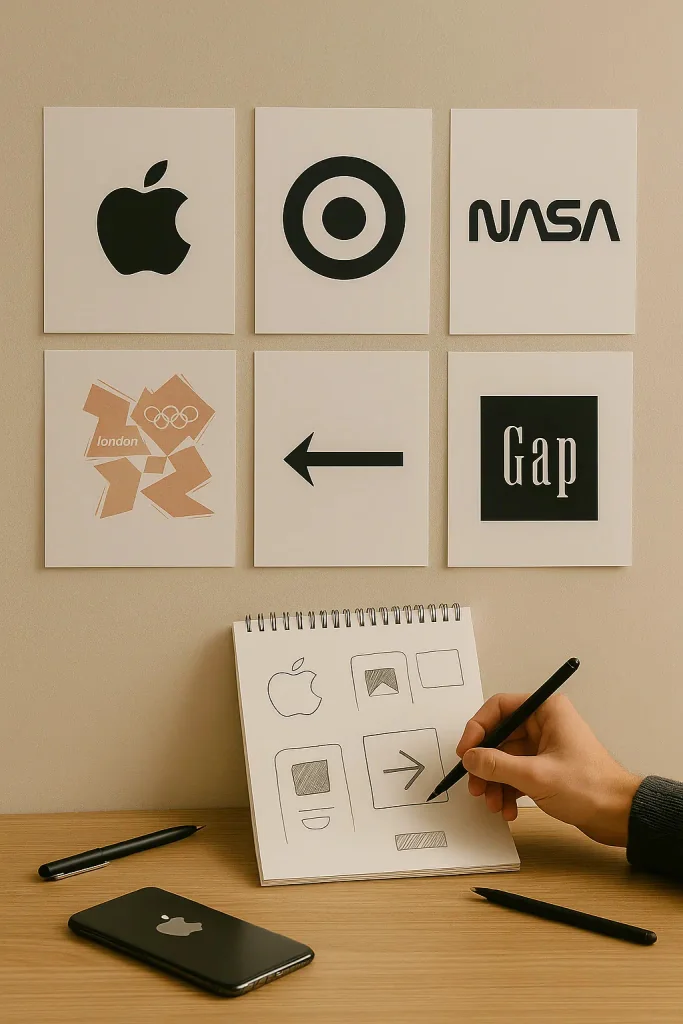
Logos that got it right
Logos that got it right
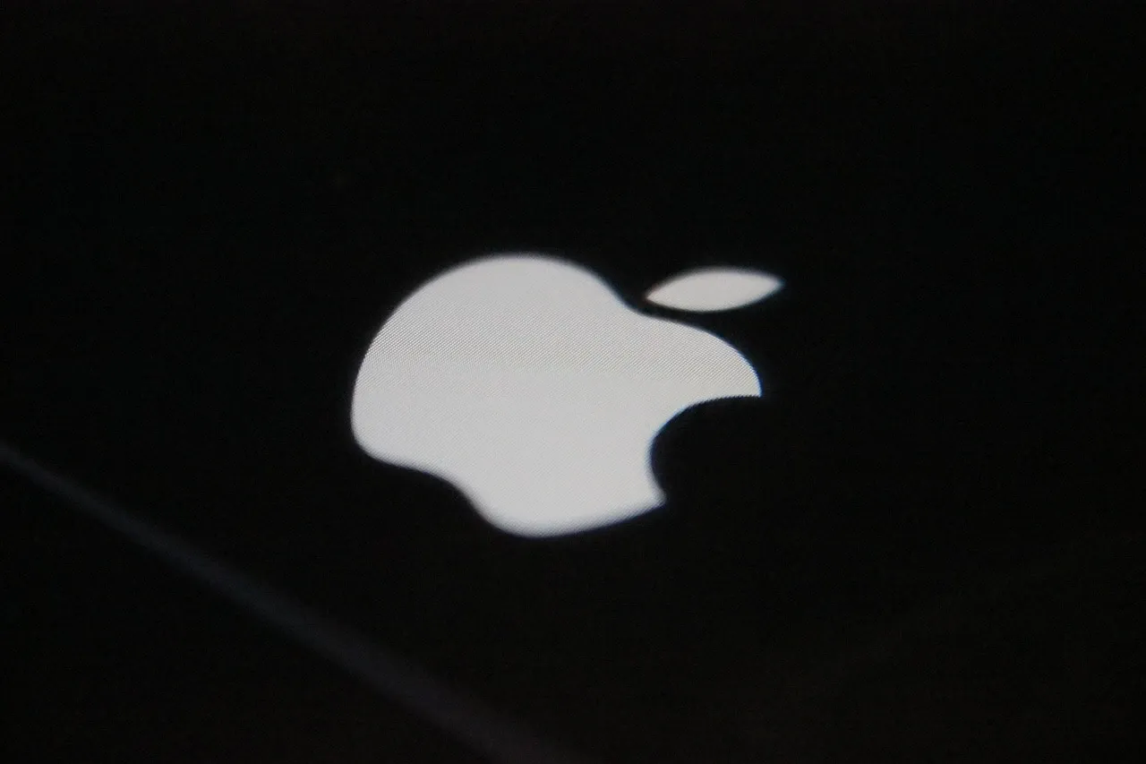
Apple
Designer: Rob Janoff (1977)
Created to launch the Apple II, the rainbow-colored logo marked the first color display. Janoff aimed for clarity and memorability, not metaphor.
Minimal. Confident. You see it once and never forget it.
No gradients. No outlines. Just a symbol that became a culture.
Target
Designer: In-house team (1962, refined in 2006)
The iconic bullseye was always about simplicity. The 2006 update refined scale and spacing for digital clarity.
Two circles. That’s it.
You know the name without reading it. That’s the power of simplicity.
NASA (Worm)
Designer: Richard Danne & Bruce Blackburn (1975)
Part of a brand modernization effort. The Worm logo was futuristic, geometric, and clean. Retired in 1992, revived in 2020.
So clean it was discontinued... then brought back by popular demand.
It communicates legacy and ambition in one glance.
⚠️ Logos that missed the mark
London 2012 Olympics
Designer: Wolff Olins (agency)
Meant to feel dynamic and youthful. It drew backlash for legibility and lack of meaning.
Tried too hard to be edgy. Ended up visually chaotic and hard to love.
Gap (2010 redesign)
Designer: Laird & Partners (agency)
Launched with little context. Helvetica + blue square was viewed as generic and off-brand. Pulled after 6 days.
A redesign that erased trust overnight.
Generic and cold, it lacked everything Gap had built.
When It Works, It Disappears
The best logos don’t compete for attention. They don’t scream. They don’t glow. They just... belong.
You don’t notice them because they’ve already done their job. They've aligned so naturally with the product, the tone, and the rhythm of the experience, they fade into the background hum of trust.
Great visual identity isn’t about being loud. It’s about being right. It’s what happens when clarity meets restraint. When the design doesn’t need to explain itself.
At B503 Studio, that’s the sweet spot:
The kind of design you almost forget to notice — until you realize you trust it.
It’s Never “Just” a Logo
It’s Never “Just” a Logo
It might not be your whole brand — but it’s often the first thing people remember. Or forget.
It’s the shape they scroll past.
The thing on the invoice.
The dot on your business card.
The mark that either feels like you — or doesn’t.
At B503, we don’t overdesign logos.
We build them with enough space for meaning to grow.
Because when the rest of your brand is clear, the logo just clicks into place.
It doesn’t need to shout.
It just needs to feel right.
Latest Updates
B503 STUDIO®
©2025
Latest Updates
B503 STUDIO®
©2025


FAQ
FAQ
01
What’s the difference between the $99/month and $110/month plans?
02
Can I edit the site myself?
03
Can I request updates to my site after it’s live?
04
What if I want to sell products online?
05
What happens if I stop paying or cancel my plan?
01
What’s the difference between the $99/month and $110/month plans?
02
Can I edit the site myself?
03
Can I request updates to my site after it’s live?
04
What if I want to sell products online?
05
What happens if I stop paying or cancel my plan?
Apr 14, 2025
It’s Just a Logo. Until It’s Not
This section explains that logos are not the creators of brand equity — but the holders of it. Like flags, they gain meaning from what surrounds them.
Design & Identity
subtle-branding
logo-design-principles
A Few That Got It Right (and a Few That Didn’t)
Let’s be clear — this isn’t about shaming logos.
It’s about understanding what makes a mark memorable… and what makes it miss.Because a logo isn’t just about looking “cool.”®
Here are a few that nailed it — and a couple that remind us why clarity, timing, and restraint matter.
Logos that got it right
Apple
Designer: Rob Janoff (1977)
Created to launch the Apple II, the rainbow-colored logo marked the first color display. Janoff aimed for clarity and memorability, not metaphor.
Minimal. Confident. You see it once and never forget it.
No gradients. No outlines. Just a symbol that became a culture.
Target
Designer: In-house team (1962, refined in 2006)
The iconic bullseye was always about simplicity. The 2006 update refined scale and spacing for digital clarity.
Two circles. That’s it.
You know the name without reading it. That’s the power of simplicity.
NASA (Worm)
Designer: Richard Danne & Bruce Blackburn (1975)
Part of a brand modernization effort. The Worm logo was futuristic, geometric, and clean. Retired in 1992, revived in 2020.
So clean it was discontinued... then brought back by popular demand.
It communicates legacy and ambition in one glance.
⚠️ Logos that missed the mark
London 2012 Olympics
Designer: Wolff Olins (agency)
Meant to feel dynamic and youthful. It drew backlash for legibility and lack of meaning.
Tried too hard to be edgy. Ended up visually chaotic and hard to love.
Gap (2010 redesign)
Designer: Laird & Partners (agency)
Launched with little context. Helvetica + blue square was viewed as generic and off-brand. Pulled after 6 days.
A redesign that erased trust overnight.
Generic and cold, it lacked everything Gap had built.
When It Works, It Disappears
The best logos don’t compete for attention. They don’t scream. They don’t glow. They just... belong.
You don’t notice them because they’ve already done their job. They've aligned so naturally with the product, the tone, and the rhythm of the experience, they fade into the background hum of trust.
Great visual identity isn’t about being loud. It’s about being right. It’s what happens when clarity meets restraint. When the design doesn’t need to explain itself.
At B503 Studio, that’s the sweet spot:
The kind of design you almost forget to notice — until you realize you trust it.
It’s Never “Just” a Logo
It might not be your whole brand — but it’s often the first thing people remember. Or forget.
It’s the shape they scroll past.
The thing on the invoice.
The dot on your business card.
The mark that either feels like you — or doesn’t.
At B503, we don’t overdesign logos.
We build them with enough space for meaning to grow.
Because when the rest of your brand is clear, the logo just clicks into place.
It doesn’t need to shout.
It just needs to feel right.
FAQ
01
What’s the difference between the $99/month and $110/month plans?
02
Can I edit the site myself?
03
Can I request updates to my site after it’s live?
04
What if I want to sell products online?
05
What happens if I stop paying or cancel my plan?
Apr 14, 2025
It’s Just a Logo. Until It’s Not
This section explains that logos are not the creators of brand equity — but the holders of it. Like flags, they gain meaning from what surrounds them.
Design & Identity
subtle-branding
logo-design-principles
A Few That Got It Right (and a Few That Didn’t)
Let’s be clear — this isn’t about shaming logos.
It’s about understanding what makes a mark memorable… and what makes it miss.Because a logo isn’t just about looking “cool.”®
Here are a few that nailed it — and a couple that remind us why clarity, timing, and restraint matter.
Logos that got it right
Apple
Designer: Rob Janoff (1977)
Created to launch the Apple II, the rainbow-colored logo marked the first color display. Janoff aimed for clarity and memorability, not metaphor.
Minimal. Confident. You see it once and never forget it.
No gradients. No outlines. Just a symbol that became a culture.
Target
Designer: In-house team (1962, refined in 2006)
The iconic bullseye was always about simplicity. The 2006 update refined scale and spacing for digital clarity.
Two circles. That’s it.
You know the name without reading it. That’s the power of simplicity.
NASA (Worm)
Designer: Richard Danne & Bruce Blackburn (1975)
Part of a brand modernization effort. The Worm logo was futuristic, geometric, and clean. Retired in 1992, revived in 2020.
So clean it was discontinued... then brought back by popular demand.
It communicates legacy and ambition in one glance.
⚠️ Logos that missed the mark
London 2012 Olympics
Designer: Wolff Olins (agency)
Meant to feel dynamic and youthful. It drew backlash for legibility and lack of meaning.
Tried too hard to be edgy. Ended up visually chaotic and hard to love.
Gap (2010 redesign)
Designer: Laird & Partners (agency)
Launched with little context. Helvetica + blue square was viewed as generic and off-brand. Pulled after 6 days.
A redesign that erased trust overnight.
Generic and cold, it lacked everything Gap had built.
When It Works, It Disappears
The best logos don’t compete for attention. They don’t scream. They don’t glow. They just... belong.
You don’t notice them because they’ve already done their job. They've aligned so naturally with the product, the tone, and the rhythm of the experience, they fade into the background hum of trust.
Great visual identity isn’t about being loud. It’s about being right. It’s what happens when clarity meets restraint. When the design doesn’t need to explain itself.
At B503 Studio, that’s the sweet spot:
The kind of design you almost forget to notice — until you realize you trust it.
It’s Never “Just” a Logo
It might not be your whole brand — but it’s often the first thing people remember. Or forget.
It’s the shape they scroll past.
The thing on the invoice.
The dot on your business card.
The mark that either feels like you — or doesn’t.
At B503, we don’t overdesign logos.
We build them with enough space for meaning to grow.
Because when the rest of your brand is clear, the logo just clicks into place.
It doesn’t need to shout.
It just needs to feel right.
FAQ
What’s the difference between the $99/month and $110/month plans?
Can I edit the site myself?
Can I request updates to my site after it’s live?
What if I want to sell products online?
What happens if I stop paying or cancel my plan?