Apr 23, 2025
The 8 core principles of UX/UI design
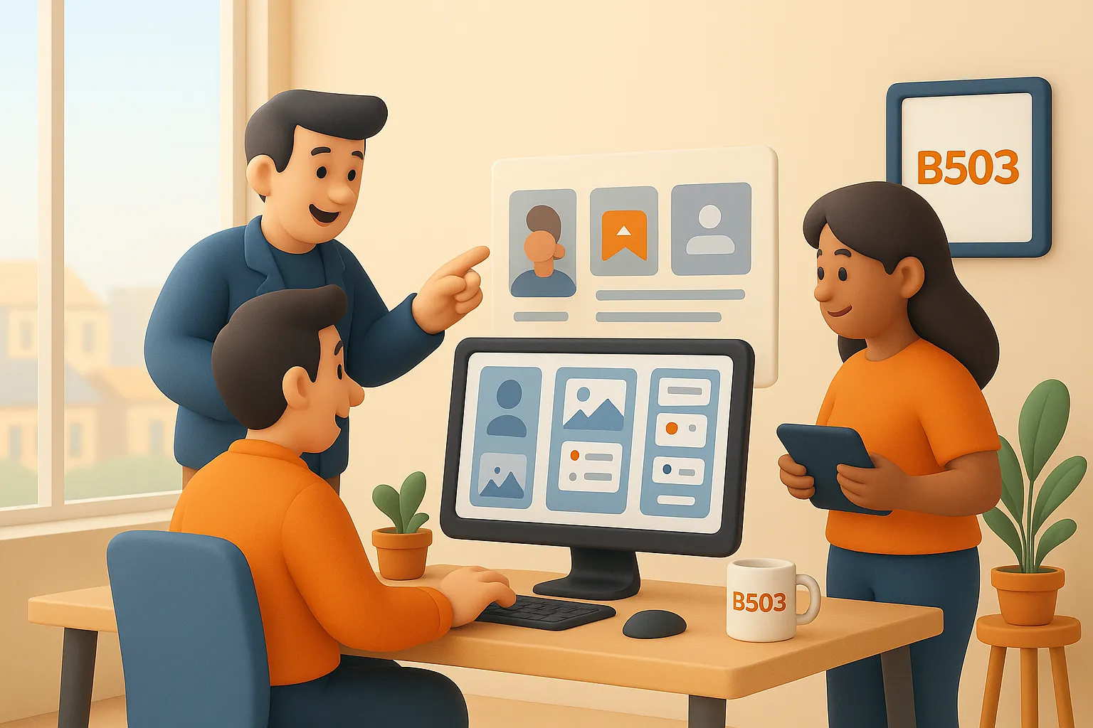
UX/UI design isn’t just about looking good — it’s about how people interact. From first click to final action, the experience matters.
At B503 Studio, we follow 8 key design principles to build products that are intuitive, inclusive, and scalable — without sacrificing creativity.
UX/UI Design
User Experience
Interface Design
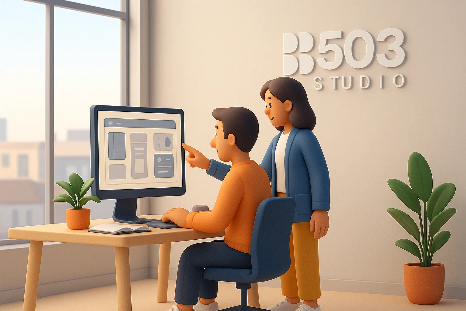
Part 1 — Building the Foundation
What every interface needs to feel intuitive from the start.
💡 If you’re just starting out in UX/UI design, this is your north star. This is what separates a pretty screen from
a usable product.
Visual hierarchy What it is:
It’s how you guide someone’s eyes. Users don’t read — they scan. You decide what they see first.
For a junior:
Don’t place everything with equal importance. Bold everything = nothing is bold.
How we apply it at B503:
We start with wireframes in grayscale. If the structure doesn’t work in black and white, no amount of color will save it.
Clarity and Simplicity What it is:
Think of this as “designing without friction.” The user should never have to guess what a button does.
Common mistake:
Trying to “wow” users with complexity instead of guiding them through clarity.
At B503:
We build flows like a story. We ask: “If I knew nothing, would this still make sense?”
Consistency What it is:
Consistency builds trust. Repetition isn’t boring — it’s comforting.
For juniors:
Create a mini design system, even for small projects. Use the same button style, same hover states.
At B503:
We create libraries from the start — this saves time, avoids errors, and creates a cleaner experience.
→ Takeaway:
If users are confused in the first 10 seconds, they’re gone. These 3 principles shape that crucial first impression — visually and emotionally.
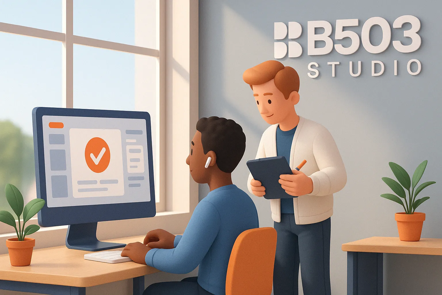
Part 2 — Connecting with Real Users
Part 2 — Connecting with Real Users
Design that communicates, responds, and includes everyone.
💡 Design isn’t finished when it looks good. It’s finished when it works for real people.
User Feedback
What it is: Feedback is the difference between "Did it work?" and "Oh yes, it worked!"
Mistake to avoid: Not showing progress during loading, or failing to confirm a submitted form.
At B503: We use subtle micro-interactions — color changes, animations, messages — to make the user feel in control.
Accessibility
What it is: Making your design usable by people with different abilities, devices, and contexts.
Mindset shift: Accessibility isn’t an “extra” — it’s part of the job. If one person can’t use it, the design failed.
At B503: We test contrast, font sizes, keyboard navigation, and alt texts by default.
Usability
What it is: The ease of use. Can someone instinctively know how to use your interface?
Common trap for juniors: Designing for beauty over function.
At B503: We ask someone who has no context to test the interface. If they hesitate or ask questions — we fix it.
→ Takeaway:
UX/UI is not about impressing other designers. It’s about helping real people do things — without thinking twice.
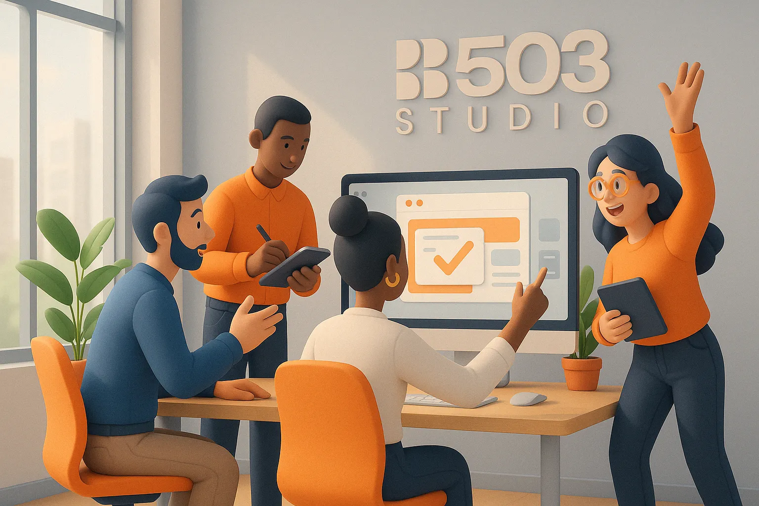
Part 3 — Evolving with Purpose
Part 3 — Evolving with Purpose
Design systems that grow, adapt, and scale.
💡 The best designers don’t just ship interfaces. They ship systems that evolve.
Mobile FirstWhat it is:
Designing for the smallest screen first forces clarity and focus.
Tip for juniors:
If it works on mobile, it will work anywhere.
At B503:
We prototype mobile-first — because that’s where users are, and where constraints spark creativity.
Continuous IterationWhat it is:
Design is never finished. Testing, learning and adjusting is part of the craft.
What juniors should know:
Feedback is not failure. The best designs often come after the third or fourth version.
At B503:
We track how users behave, not just what they say. Then we refine.
→ Takeaway:
Great UX/UI lives in motion. The best products grow with users — they’re never stuck in version 1.
Latest Updates
B503 STUDIO®
©2025
Latest Updates
B503 STUDIO®
©2025

FAQ
FAQ
01
What’s the difference between the $99/month and $110/month plans?
02
Can I edit the site myself?
03
Can I request updates to my site after it’s live?
04
What if I want to sell products online?
05
What happens if I stop paying or cancel my plan?
01
What’s the difference between the $99/month and $110/month plans?
02
Can I edit the site myself?
03
Can I request updates to my site after it’s live?
04
What if I want to sell products online?
05
What happens if I stop paying or cancel my plan?
Apr 23, 2025
The 8 core principles of UX/UI design
UX/UI design isn’t just about looking good — it’s about how people interact. From first click to final action, the experience matters.
At B503 Studio, we follow 8 key design principles to build products that are intuitive, inclusive, and scalable — without sacrificing creativity.
UX/UI Design
User Experience
Interface Design
Part 1 — Building the Foundation
What every interface needs to feel intuitive from the start.
💡 If you’re just starting out in UX/UI design, this is your north star. This is what separates a pretty screen from
a usable product.
Visual hierarchy What it is:
It’s how you guide someone’s eyes. Users don’t read — they scan. You decide what they see first.
For a junior:
Don’t place everything with equal importance. Bold everything = nothing is bold.
How we apply it at B503:
We start with wireframes in grayscale. If the structure doesn’t work in black and white, no amount of color will save it.
Clarity and Simplicity What it is:
Think of this as “designing without friction.” The user should never have to guess what a button does.
Common mistake:
Trying to “wow” users with complexity instead of guiding them through clarity.
At B503:
We build flows like a story. We ask: “If I knew nothing, would this still make sense?”
Consistency What it is:
Consistency builds trust. Repetition isn’t boring — it’s comforting.
For juniors:
Create a mini design system, even for small projects. Use the same button style, same hover states.
At B503:
We create libraries from the start — this saves time, avoids errors, and creates a cleaner experience.
→ Takeaway:
If users are confused in the first 10 seconds, they’re gone. These 3 principles shape that crucial first impression — visually and emotionally.
Part 2 — Connecting with Real Users
Design that communicates, responds, and includes everyone.
💡 Design isn’t finished when it looks good. It’s finished when it works for real people.
User Feedback
What it is: Feedback is the difference between "Did it work?" and "Oh yes, it worked!"
Mistake to avoid: Not showing progress during loading, or failing to confirm a submitted form.
At B503: We use subtle micro-interactions — color changes, animations, messages — to make the user feel in control.
Accessibility
What it is: Making your design usable by people with different abilities, devices, and contexts.
Mindset shift: Accessibility isn’t an “extra” — it’s part of the job. If one person can’t use it, the design failed.
At B503: We test contrast, font sizes, keyboard navigation, and alt texts by default.
Usability
What it is: The ease of use. Can someone instinctively know how to use your interface?
Common trap for juniors: Designing for beauty over function.
At B503: We ask someone who has no context to test the interface. If they hesitate or ask questions — we fix it.
→ Takeaway:
UX/UI is not about impressing other designers. It’s about helping real people do things — without thinking twice.
Part 3 — Evolving with Purpose
Design systems that grow, adapt, and scale.
💡 The best designers don’t just ship interfaces. They ship systems that evolve.
Mobile FirstWhat it is:
Designing for the smallest screen first forces clarity and focus.
Tip for juniors:
If it works on mobile, it will work anywhere.
At B503:
We prototype mobile-first — because that’s where users are, and where constraints spark creativity.
Continuous IterationWhat it is:
Design is never finished. Testing, learning and adjusting is part of the craft.
What juniors should know:
Feedback is not failure. The best designs often come after the third or fourth version.
At B503:
We track how users behave, not just what they say. Then we refine.
→ Takeaway:
Great UX/UI lives in motion. The best products grow with users — they’re never stuck in version 1.
FAQ
01
What’s the difference between the $99/month and $110/month plans?
02
Can I edit the site myself?
03
Can I request updates to my site after it’s live?
04
What if I want to sell products online?
05
What happens if I stop paying or cancel my plan?
Apr 23, 2025
The 8 core principles of UX/UI design
UX/UI design isn’t just about looking good — it’s about how people interact. From first click to final action, the experience matters.
At B503 Studio, we follow 8 key design principles to build products that are intuitive, inclusive, and scalable — without sacrificing creativity.
UX/UI Design
User Experience
Interface Design
Part 1 — Building the Foundation
What every interface needs to feel intuitive from the start.
💡 If you’re just starting out in UX/UI design, this is your north star. This is what separates a pretty screen from
a usable product.
Visual hierarchy What it is:
It’s how you guide someone’s eyes. Users don’t read — they scan. You decide what they see first.
For a junior:
Don’t place everything with equal importance. Bold everything = nothing is bold.
How we apply it at B503:
We start with wireframes in grayscale. If the structure doesn’t work in black and white, no amount of color will save it.
Clarity and Simplicity What it is:
Think of this as “designing without friction.” The user should never have to guess what a button does.
Common mistake:
Trying to “wow” users with complexity instead of guiding them through clarity.
At B503:
We build flows like a story. We ask: “If I knew nothing, would this still make sense?”
Consistency What it is:
Consistency builds trust. Repetition isn’t boring — it’s comforting.
For juniors:
Create a mini design system, even for small projects. Use the same button style, same hover states.
At B503:
We create libraries from the start — this saves time, avoids errors, and creates a cleaner experience.
→ Takeaway:
If users are confused in the first 10 seconds, they’re gone. These 3 principles shape that crucial first impression — visually and emotionally.
Part 2 — Connecting with Real Users
Design that communicates, responds, and includes everyone.
💡 Design isn’t finished when it looks good. It’s finished when it works for real people.
User Feedback
What it is: Feedback is the difference between "Did it work?" and "Oh yes, it worked!"
Mistake to avoid: Not showing progress during loading, or failing to confirm a submitted form.
At B503: We use subtle micro-interactions — color changes, animations, messages — to make the user feel in control.
Accessibility
What it is: Making your design usable by people with different abilities, devices, and contexts.
Mindset shift: Accessibility isn’t an “extra” — it’s part of the job. If one person can’t use it, the design failed.
At B503: We test contrast, font sizes, keyboard navigation, and alt texts by default.
Usability
What it is: The ease of use. Can someone instinctively know how to use your interface?
Common trap for juniors: Designing for beauty over function.
At B503: We ask someone who has no context to test the interface. If they hesitate or ask questions — we fix it.
→ Takeaway:
UX/UI is not about impressing other designers. It’s about helping real people do things — without thinking twice.
Part 3 — Evolving with Purpose
Design systems that grow, adapt, and scale.
💡 The best designers don’t just ship interfaces. They ship systems that evolve.
Mobile FirstWhat it is:
Designing for the smallest screen first forces clarity and focus.
Tip for juniors:
If it works on mobile, it will work anywhere.
At B503:
We prototype mobile-first — because that’s where users are, and where constraints spark creativity.
Continuous IterationWhat it is:
Design is never finished. Testing, learning and adjusting is part of the craft.
What juniors should know:
Feedback is not failure. The best designs often come after the third or fourth version.
At B503:
We track how users behave, not just what they say. Then we refine.
→ Takeaway:
Great UX/UI lives in motion. The best products grow with users — they’re never stuck in version 1.
FAQ
What’s the difference between the $99/month and $110/month plans?
Can I edit the site myself?
Can I request updates to my site after it’s live?
What if I want to sell products online?
What happens if I stop paying or cancel my plan?